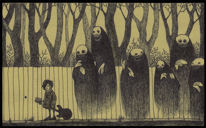
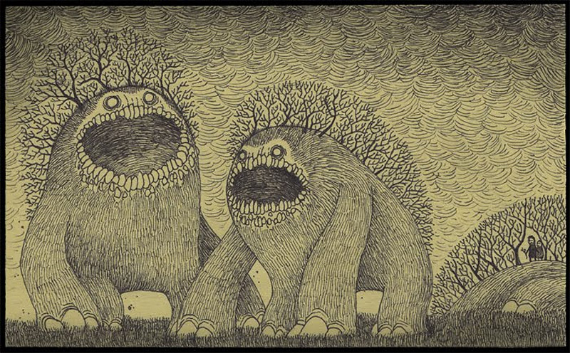
Don Kenn grew up in Denmark in the 70's and his child side still has not left him. Kenn creates really cool sketches on a post it notes. I find his art quite comical. I absolutely love it! They are very dark and creepy with a fun childish kick to them. His art tells a short story about monsters. I love the monsters they are all very creative and travel together; there is no piece where a monster is alone. The deer monsters are cute and innocent traveling through the woods. The ghosts crack me up because they are just funny looking and they are picking on a poor emo boy! Kenn was probably a lonely child who was followed around my ghosts that made fun oh him. My favorite monsters are the tree monsters. They are actually kind of cute. All of Kenn's artwork has nature tied into the image. What I like about his drawings are the lines he uses. He uses lines to create the detail in the fur of the monsters and the trees.
Sunday, December 11, 2011
Artist Blog 22: Debbie Smyth
Ahh this is so cool! Debbie Smyth creates illustrations by using pins and thread. By using these materials Smyth creates amazing artwork creating stories for her viewers. Every pin is placed according to sketch and is connected by threads. Tight threads create the object and lose threads represent motion. Out of several of lines different objects, letters are created and look absolutely amazing. These pieces have to take several hours to complete because they are not small-scale projects. Smyth has been hired by New York Times to complete corporate projects. Most of Smyth's projects are stories recorded by long walks. In the image above all the windows and doors are closed formed but inside there are details that are left open but still create a shape. When creating the man pushing the cart she outlined him with more threads then anything els. This is what focuses the eye on the man in the middle and tells the story about that man. I love the message in the below piece "Live what you Love" its beautiful. I love the colors and font used to create this. Smyth's art does not look that hard on a small scale. I would really like to try this on a wall in my house, it would be a really fun project.
Artist Blog 21: Jennifer Collier
Jennifer Collier creates wonderfully crafted paper household products with just bounding, waxing, and stitching paper and fabric together. Most of Collier's pieces remind me of feminine yearly nineteenth and eighteenth century objects like tea cups, watering can, typewriter, sewing machine, shoes, and others. What makes these objects very feminine is the type of paper she uses. The papers used to create most some objects are floral. All her artwork is created just of paper and fabrics, this making the objects hollow inside. The papers used to create the objects have some kind of tie with the object. The binoculars are made out of sheet music; this ties together because binoculars were used at operas or plays. Collier did a great job with detail. Every object is created to the smallest detail. Every angle is precise and shaped well. To create a better effect for the binoculars and camera Collier added a plastic material to make them more realistic and seam functional. I love the camera. I really like the map paper that is used to create it. I also like the style of the camera. This also corresponds with the twentyth century, which is the main theme in all her work.
Artist Blog 20: Christine Krainock
Christine Krainock's art attracted me because of the actual texture used in her artwork. From the looks of her artwork it seems that she uses a lot of paint to give her art somewhat of a three dimensional effect. At first I thought she used real flower pedals to create flowers. Krainock's inspiration is nature and the beauty nature gives the planet.
I love the flowers. I love the scale of the flowers; how they are large in the center and slowly shrink as they reach the end of the branch. The main objects of the painting are the flowers. Krainock attracts the viewer’s attention to the flowers by creating a darker color background. The background is interesting. She uses natural, neutral colors to create a warm environment. The brush strokes in the background create a great actual texture to the art. All the strokes have a different color, depending on where the strokes are they are darker or lighter. Toward the center of the piece the strokes are lighter creating a sunlight effect on the painting. Tuesday, December 6, 2011
Artist Blog 19: Gavin Mackey
![]() |
| Eve |
Mackey's work is very dark but brilliantly executed. The representation of the characters are great! I can tell exactly wich character is wich. Most of the characters like Charmander look sad and disgusting like they have been through really rough times. The recreation of Qubone looks like he has gained a couple pounds and has aged about thirty years. I think this art is funny because the characters look like they have aged and this is them after their tv lives. It is really funny actually. The artist did a good job and I hope to see more of his work.
![]() |
| Qubone |
![]() |
| Charmander |
Artist Blog 18: Martin O'Neill
![]() |
| London Calling |
In the piece London Calling there is no one large section that catches your eye. Your eye sees all parts of the work. The sections are evenly distributed throughout the page. The colors all complement each other. The peoples skin color has kind of an opaque look to it. This is part of the retro technique that O'Neill uses wonderfully.
I love Royal Mail because of the colors. The colors perfectly display a fun filled environment at the beach. He does a great job of portraying his goal with the color. This image reminds me of polyvor, a website where you put together a collage of clothing and design. It is a beautiful piece and definitely will grab the viewers attention. It makes me wish it was summer right now!
![]() |
| Guardian Guides |
![]() |
| The Royal Mail |
Sunday, December 4, 2011
Artist Blog 17: Jen Stark
![]() |
| 'sunken sediment', 201031'' x 42'' x 38'' |
![]() |
| 'the highest point', 2010 36'' x 27'' x 2.5'' |
![]() |
| 'centrifugal', 2010 40'' x 31'' x 5'' |
Subscribe to:
Posts (Atom)


